
New Dulux Colour Trends: Top Interior Colours for Winter 2017
25 May 2017, 3:22PM
Pead PR
Offering a luxurious take on the industrial trend, leading paint company Dulux predicts that a moody palette with warm metallics will dominate interiors during the coming colder months.
Promoting raw, pared back beauty, this winter’s colour palette is derived from the 2017 Dulux Colour Trends’ Construct theme. Inspired by the renewed interest in Brutalism combined with the influence of the geometric shapes of the Bauhaus period, Construct offers a minimalist look with a focus on natural materials, structure and form.
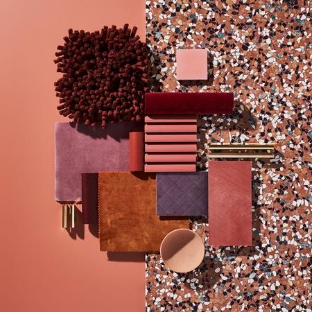
Dulux Colour & Design Specialist Davina Harper says that the key paint colours including Boulder Beach, Tirau Double, Moonlight Creek, Narrow Neck Half, Five Fingers Peninsula, Dark Cloud Range, Concrete Effect and Copper Effect can make any space in the home feel modern and contemporary.
"These colours are very diverse and can be used in most interior spaces. Being predominantly neutral, they are extremely accessible, from the lightest variation, Dulux Narrow Neck Half, a soft greige, right through to the darkest hue, Dulux Moonlight Creek, which is an alluring deep blue,” says Davina.
Whilst homeowners may not naturally gravitate to deeper colours, according to Davina these neutral shades are easy to incorporate without overwhelming a space. Darker hues can create a dramatic backdrop to really highlight furnishings and accessories and truly.make a statement. These deeper colours can also be balanced perfectly when paired with lighter schemes. With tactility being a key element in the Winter palette, balancing textures and layering accessories will create a perfect scheme and add another dimension to the space.
“Concrete is a multipurpose material that is no longer reserved just for floors or the outdoors.” Adding a Concrete Effect with its cool hue balances out warmer textiles while hints of Copper Effect can create a harmonious and welcoming space. “Incorporating textured surfaces such as Copper Effect adds further dimension and creates focal points in a predominantly minimalist colour space. This touch of copper is ideal for highlighting architectural details and can also be applied to home accessories,” says Davina.
A somewhat understated colour palette, Construct allows homeowners to experiment with different neutral colour combinations paired with textures to add interest to a room.
“The dark blues in this palette such as Dulux Moonlight Creek contrast beautifully against a concrete surface whether this be an entire wall, a fireplace or an upcycled piece of furniture. It’s important to remember that these paint colours can be used on a lesser scale too, even the smallest changes can transform a room,” says Davina.
The Dulux Colour Trends, ‘Antidote: A Colour Cure’, are the result of extensive research into international trends, with inspiration drawn from design trade shows, fashion, technology and media. For more information, images or interview opportunities contact: Gabriella Brunton, Pead PR T: 09 918 5556 M: 022 090 7377 E: gabriella@peadpr.co.nz